
A few weeks ago I was at a conference where Noah Kagan of SumoMe fame was part of a “Tear apart my landing page” workshop. The premise was simple: We showed him our landing pages, he showed us how to improve them.
I didn't put HPD up for the tear-down (I'm a sensitive guy and had already cried once that month), but I learned a ton while watching Noah and Ian (from TropicalMBA) go through various other websites and point out what was and wasn't working.
The biggest takeaway I got though came from the realization that I had at my disposal a pretty powerful tool in SumoMe, and I'd not really been using it.

Ok, apart from the share buttons floatingdown the side of this page (Click them, see what magic happens), I wasn't using SumoMe at all.
I was vaguely aware that there was some HeatMap tool and some Content Analytics thingy that were part of the SumoMe suite, but as usual with online tools, you often don't realize the beauty until you've been shown some practical applications for them.
I think that's also the case for you all who are reading this. Chances are high that you have SumoMe installed as well, and you probably also only use it for the share buttons.
Therefore, I'm going to walk you through some of the insights and successes I gained over the last couple of weeks using SumoMe Pro.
Note: You don't HAVE to use the Pro version to repeat the feats of this case study, but the free version is limited to tracking about 100 visitors, and you'll get more out of it if you're pro. Makes sense really.
If your site is new, has limited traffic, or you're on a budget, stick with the free version.
Case One – Cleaning Up Menu Bars
Got too many options on your menu bar? Probably. It's hard to really keep your menu bar concise because as the website owner, you think every page is important and want it to be featured prominently.
As Noah pointed out though, the fewer choices you give people, the easier it is for them to do what you want.
In my case, I used the Heat Map tool to take at look at the HPD nav bar and realized the following:

1.) Nobody was clicking on my subscribe button – I should remove it.
2.) My “About” page was getting more clicks than I thought – I should revamp it and check it is still current.
3.) Simply by going through the process of analyzing my homepage like this, I learned how messy and in need of a revamp it is.
4.) People love my blog section.
Now, I could easily have found out how popular my About page or my Blog page were by going into Google Analytics, but sometimes you need a more visual representation like this for it to sink in.
Case Two – Improving Review Pages
Example A.)
I have one review page which is pretty popular but doesn't get as many conversions as I'd like. It does OK, but I wanted to see if I could improve it, and I wanted to know if it was optimized well. Different niches perform better with different styles.
The problem with Conversion Rate Optimization (CRO) is that you sometimes have no idea what the problem is, and short of split-testing everything, it can be hard to figure it out.
One theory I had was that the content was poor and people weren't reading the whole post.
Using the SumoMe Content Analytics, I was able to determine that 30% of page visitors were reading the whole page, and the “average read” mark was 85% of the way down the page.


This lead me to the conclusion that the content was at least compelling enough to encourage people to read the full length of the page.
How were they interacting with it though?

Every single major CTA on the page had a big fat hotspot on the button, meaning that people were indeed clicking the CTA's.
At this point I came to the following conclusions:
1.) People were reading/scrolling for over 85% of the page.
2.) People were clicking pretty much every CTA on the page.
Therefore, my job as an Amazon affiliate in this case was more or less done, and I could consider the page well optimized. I could probably look at working on the content more in terms of what it says and I could consider sending people through an opt-in to help warm them up, but from a basic on-page conversion point of view, this page looked golden.
Example B.)
Moving onto the next site I did this with, the picture is very different.
On this page, the Average Read was 79%, which still looks like a decent amount, but it's the place where readers start to drop off which tells the real picture.
Without showing you a screenshot to protect the niche, let me summarize quickly.
I had reviewed a product which had a lot of issues but was still worth using. At the bottom of the page, I summarized that in spite of the various issues, people should still go ahead and use it. I even recommended a few workarounds that would negate the downsides and make it a decent product.
The problem was, there was a massive drop-off in readers at the bottom of the “Things wrong with this product” section, so a lot of people weren't reading to the conclusion.
Not only that, but my CTA at the bottom of the page wasn't very good either, so only 1% of page readers were clicking through.
Simply by not wording things well and not making my final thoughts clear, I was inadvertently driving people away from a product that could work well for them. Oops.
The fix was pretty simple though, I just added a summary at the top of the review and made the calls to action more obvious.
So far, conversions are up, but it's too early to tell the full results.
Case Three – That ‘About Page'
I've heard people mention that the About page is one of the prime pieces of real estate on your website. Actually I think it was Noah who mentioned that. Thanks Noah.
The thing is though, Google Analytics only tells you how many people read your page, and roughly how long they stayed. It also mentions if they bounced or not.
That's great, but are people really interested in the HPD story, or do they just want to see if I'm a real person?
Based on the findings Content Analytics gave me, I'm going to say that they are indeed interested, and this is really insightful for me:
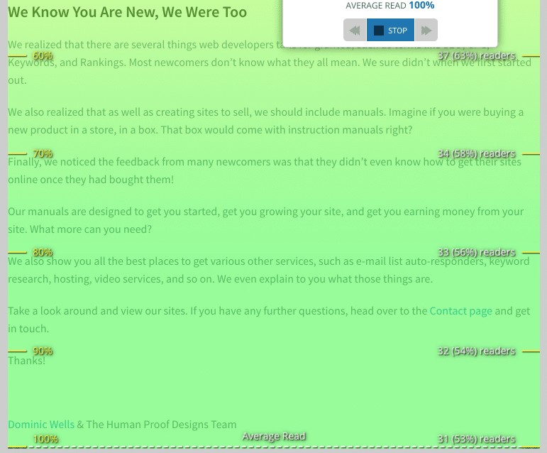
The average person reads 100% of the page, which means that it must be at least a little bit compelling. It also shows that this is a missed opportunity in terms of asking people to become a subscriber, or sending them to a landing page of choice.
Once again, this is a huge insight, even if it does seem a little basic on the surface.
It's Nothing Revolutionary – But The Insights Can Make A Huge Difference
I've only really scratched the surface so far in terms of what SumoMe brings to the table.
In the future, I will have to prepare another case study where I start off with a mediocre landing page and use SumoMe findings to optimize it properly. Right now though, I can safely say that it's going to become part of my regular arsenal from now.
An added bonus of using the tool is that it also changes how you think about your site. You don't just think in terms of traffic and clicks, but instead you think more about behavior, and that's the real key to making a big difference to your site's performance.
I strongly recommend you consider at least installing the free version, but I do find that being limited to only 100 visitors per site is not going to give you a big enough picture in terms of assessing your site, in which case you'll want to opt for the paid upgrade.
Got any questions or suggestions? If we get enough questions that I can't answer, I'm sure Noah will chime in when he gets some free time.
Nice writeup Bryon!