
As June is “CRO Month” (chosen by our paid members), we have been creating a lot of content around this topic. Some of it has taken place in our free FB group, some in our paid FB group, and now we're extending it to this blog.
Last week, we caught up with Kurt Philip and did an AMA, plus a live CRO example for our paid members.
We've decided to write up the AMA part of that here on the blog for all audience members to read and add it to our podcast roll too.
If you're interested in seeing the live CRO examples, you'll want to check out our course and get lifetime access to the group.
Kurt is a leader in Conversion Rate Optimization, and has worked with hundreds of clients to help increase their conversions.
As the “CRO” guy, he’s joined us to share some of his most valuable strategies for increasing CRO, whether you’re just starting out or well on the way scaling your niche sites.
In this post, we'll go through some commonly asked questions about CRO, and dive into Kurt's valuable wisdom about how to increase conversions in the most effective way possible.
What is the best place to start with Conversion Rate Optimization?
First of all, you want to make sure you’re paying attention to CRO right off the bat. Even if you’re just starting out, your site should be performing and converting at a baseline level. Too many people miss out on income in the early days of their site because they think they can put off thinking about CRO until later.
Here are some of the things you should focus on when starting out with CRO:
Creating templates and systems
Creating templates and systems for CRO should be part of every new site you create.
Just as with SEO, it’s vital to instill common practices to stay consistent with all of your sites. When systems are in place, you won’t miss anything along the way.
Put in the legwork early on to create these standard practices, and you’ll reap the benefits later. It will take time to come up with templates and systems, but optimizing the conversions for future sites will be much easier.
Set up systems and templates for:
- Split testing design elements (comparison charts, sidebars, CTA buttons, etc.)
- Split testing copy (product copy, comparison chart content, headlines, etc.)
- Split testing pricing details
- Optimizing mobile experience
Correcting common CRO problems
Once your systems and templates are in place, you’ll avoid plenty of the common ways people miss out on revenue. For example, it’s amazing how many people fail to check their sites on mobile – and miss out on 30-50% of revenue because of it!
Here are some common problems we often see with CRO:
- CTA button isn’t visible
- Huge walls of text before CTA
- CTA is a text link, making it hard to click on (especially for mobile)
- Comparison charts don’t have images
- Distracting sidebars
Best use of sidebars
Some people add a sidebar onto their pages for internal linking, incorporating items like top 5 pages and banner ads. And this can work well for pages without a buyer-intent keyword because you can direct the user to other relevant pages.

Kurt PhilipConvertica.org
When used improperly, a sidebar can actually take away from the potential benefits of the SEO on that page.
On a buyer-intent keyword page, a sidebar can be distracting and lower conversions.
When we test a sidebar page vs. a full-width page with a buyer-intent keyword like “Buy” or “Review”, we’ll often see that the full-width page converts better. So keep in mind what type of page you’re using the sidebar on to increase conversions rather than take away from them.
Don't rely on a “one-size-fits-all” approach
While it’s tempting to seek out one-size-fits-all solutions, they don’t really exist for CRO. What you apply to one site that works, may have completely different results on another site. This is just the nature of the game and means that it’s vital to test every change you make – not just make site-wide changes.
There are best practices that will work well on a general scale – for example, certain CTA buttons may work better than others – but overall, commit to testing and figuring out what works on a page-by-page basis until your systems are so highly tuned that you're seeing universal improvements with global changes.
Use the 80/20 Principle

Vilfredo Pareto, besides having a bad**s beard, was a really smart man you know.
It can be overwhelming trying to figure out where to start with CRO on your site. But the 80/20 Principle can help you gain your starting point, and stay focused on what’s actually going to get you results.
The 80/20 Principle says that 80% of your results come from 20% of your efforts. So how does this apply to CRO? Easy.
80% of your revenue generally comes from 20% of your pages – which comes out to approximately the top 5 pages on your site. Identifying these pages will give you a clear map as to where, to begin with, CRO.
Know Your Buyers
Every page on an SEO site has a different buyer awareness or attitude. (If you have a site selling footwear, you have an entirely different buyer profile for someone looking for hiking shoes vs. socks.)
This means that each page on your site may have a different effect if you roll out the same type of elements.
Here’s the rule of thumb for global changes: If you do a test on your top 5 pages and they’re all 30-40-50% increases, then that change will work site-wide. But if some pages are up, some are down, and some are even – then you need to test each change on a page-by-page basis with different sub-IDs.
Be mindful of your changes
If you start making tons of changes at once, you won’t know what’s actually creating results. It’s all about systems and management – know what you’re changing and when, so you can test for exactly what’s changing.
Oftentimes, one change will affect another, or even cancel the other out. You might see one change create a 20% increase in conversions, while another creates a 20% decrease.
So, how to test for this? You'll want to pull reports, exporting the raw data and looking at the increases on mobile and desktop for the same test. Make sure to pull the data down to device level, as this is an area many people miss out on potential revenue.
Where is the best place to start CRO on my site?
It’s probably no surprise that you want to start testing CRO on the most highly trafficked pages on your site.
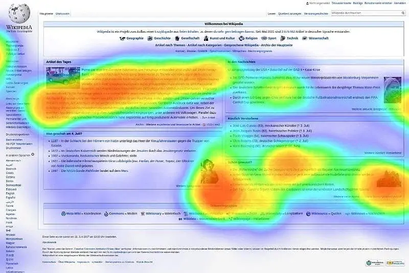
Install heat maps on your top 5 revenue pages, so you can see where people are spending most of their time. Heat maps are a fantastic tool to show where users are clicking, moving their mouse, and acting on your site. On affiliate sites, this will usually be comparison tables or top product reviews.
Once you’ve identified the hot spots on your top 5 pages, split test those areas so you can get some quick data.
It’s important to use the heat maps because you’ll gather data much quicker than by testing random areas of your site. For example, you might test the CTA button at the bottom of the page and get a few clicks per week – but if you’re testing the comparison table where people are clicking the most, you’ll gather far more data in less time.
Tools for heat maps:
VWO
VWO is a great heat map tool for agencies, as you’re able to cross-reference your heat maps into one test, all in one platform. If you’re running hundreds of tests at a time, it’s important to have a streamlined process to manage all of the data.
It’s not cheap though, so this might not be the best tool if you’re just running one or a few sites.
This is a free heatmap plugin for WordPress that works well for single sites. It allows 5 pages, which is usually more than enough since 80% of your revenue will generally come from 5 pages on your site.
We recommend Heatmap.me for beginners, as it’s free and simple to use – simply install the plugin, and record heat maps. This tool also allows you to overlay the data live on your site in the browser, so you can see the information visually.

Another tool that uses both heat mapping and content analytics to show where people stop scrolling on your page.
For example, if 80% of visitors only read the top half of your page, you can quit tweaking with the comparison tables or other elements at the bottom.
Probably the most in-depth tool, Hotjar also includes a scroll map so you can see where people are dropping off on the page. There is a ton of functionality and analytics with this tool, but it tends to slow downloading time up to 2-3 seconds.
Each of these tools has its pros and cons, and what works best for one person might not work best for everyone. Try them out and see which one works best for you.
What are the first elements I should test on my page?
It really depends on the site, but here are some good places to start:
Comparison charts: Test vertical vs. horizontal format. Generally, horizontal works better than vertical based on the way the eye moves.
Showing pricing vs. not showing pricing: Use Amazon API to test which converts higher.
Call to Action: Test different variations and placements of your CTA button, always using one that functions well on different devices (that means always testing on mobile!)

Mentioning Amazon: You can test for mentioning Amazon vs. not mentioning Amazon – sometimes not mentioning it can convert higher.
Images: You always want crisp, high-resolution images in your comparison charts and other areas on your site.
Mobile purchasing: Mobile purchasing has changed so much in the past few years. With Apple Pay, people can pay with just a thumbprint. It’s an entirely different mentality now with regards to purchasing online, so keep this in mind when testing your other elements.
Testing Comparison Charts
Kurt PhilipConvertica.org
Comparison tables should be a big focus for your site, as they tend to be one of the most highly trafficked areas for potential buyers.
Again, use heat maps to identify the top charts to gather data – when you don’t have enough traffic, it’s easy to call the test off early before you have sufficient stats.
Areas to test on your comparison charts:
- Button tweaks
- Images
- Comparison categories
In your comparison tables, you want to think beyond just having the top 5 or top 10 for a given product. Each product on your site will attract a completely different buyer awareness, so you need to create comparison charts for each of these different consumer attitudes.
These might includes charts like “Best overall,” “Best on a budget,” “Best high-end,” and “Best for enthusiasts.” Take some time to see what makes the most sense for your products!
Remember: the purpose of your site is to attract and inform a variety of different types of buyers. There isn't a one-size-fits-all shortcut to appeal to them all, so creating information for each of these different segments has a good chance of increasing your conversions.
Using Amazon reviews
Feel free to use Amazon reviews as your benefits and features in your comparison charts. Your customers are reviewing the products for you, so this can be your direct insight for what to write! It’s a great way to speak directly to the different buyer attitudes in your market, using the exact language that makes sense to them.

You do NOT want to literally copy and paste or use screenshots of customer reviews from Amazon on your site. That goes against Amazon Associates' TOSKurt refers here to using the reviews to get the exact information customers are sharing about what's good and bad about the product. Rephrase and you're good to go.
What are some strategies for split-testing?
For every split test, take your control page (which is how the original site looks,) then duplicate the page and make changes to that. Make sure to add a new sub-ID onto all the sub-affiliate links so you can track how that duplicated page is converting – not just from a clicks and conversion perspective, but from a revenue perspective.
This is key: you must make sure you’re increasing revenue, not just clicks!
Many people make changes that increase click-throughs, but they don’t actually see a change in their revenue.
Now if you’re increasing your clicks by 100 or 200%, of course your revenue will be up. But don’t rely on increased clicks to tell you that your revenue is increasing – test it!
How long should I run a test?
A few major variables come into play here:
Traffic
If you have a high volume of traffic, you can call the test sooner than if you have lower traffic. More clicks and more users equal more data and stats to make conversion-optimizing changes.
Control vs. Variation

Another variable that comes into play is how different the control is versus the variation. If you have a huge difference between your sites, you can call your test more quickly than if there is only a 1-2% difference. With a smaller difference, you may need thousands more views to be able to call statistical significance.
If you identify a change that increases conversions 20-30%, then generally for around 1000 views per variation you should be able to get 95%+ statistical significance.
Should I tweak my fonts and font sizes?
Font changes are really a low-hanging fruit that plenty of people are tempted to tweak with, when in reality they don't have a ton of impact for your site’s conversions.
If you’re breaking industry standards and using a weird font for some reason, then changing that will probably show improvements – but if you’re staying close to industry standards, then tweaking fonts and sizes isn’t going to turn the dial too much.
You will see far greater results by running tests on the comparison tables and other more significant areas of your site.
Should I just give my whole site a redesign?
If you’re looking at doing a redesign, first test your new design against your old design.
Get an HTML version of your new design done in Photoshop, then upload that page to your same server as your website and run it as a split test. Test the new design live against your old page so you can see the results before investing in a redesign.
Taking this step can easily save you potentially $10-15k on a redesign that might not even increase conversions. Remember: prettier and newer isn’t always better! It all comes down to the ways you’ve optimized elements of your site according to hard data.
Parting thoughts on CRO?
Setting up consistent and methodical systems is your best bet for improving your conversion rates, especially once you have many sites up and running.
Stay focused on the most highly trafficked parts of your site, like comparison charts and product reviews, and buyer-intent keywords pages. And don't get hung up on flashiness – oftentimes, a simple WordPress site can outperform a flashy, expensively-designed site! Focus on simplifying your design and making it as direct and easy as possible for your customer to learn about what they need, and purchase on the spot.
Next month is Keyword Research month, so stay tuned for more content on this topic, and remember that we save our best training for those who're students of the Human Proof Method
First of all Thanks for this awesome article Kristen.
I really loved the strategies shared here especially the 80/20 principle and identify the pages.
Thanks
Nice Article Is realy works for me
A good plugin for table is table maker. Its very easy to use, user friendly, responsive and with good options…
Hi,
It is a great article and I will read it a couple of times more. However I have 2 questions. I have a niche site and I use Amazon. I have %33 clickthrough rate and %5-6 conversion rate. I used to use tables and buttons but the click through rates are not so high so I removed them. My question is that is %33 click-through rate good enough? And can you suggest a good plugin for tables?